(Because Staring at the Same Walls Through Winter Does Things to a Person)
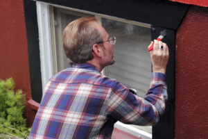
If you’ve ever walked into a paint store feeling confident, only to freeze in front of a wall of swatches that all look the same until they suddenly don’t, you’re not alone. Choosing a paint color is sneaky like that. It feels simple until it’s not. And once you live with a color for a few years, you start noticing it… a lot.
February in Brunswick doesn’t bring snow, but it does bring more time indoors. The air’s damp, the light shifts throughout the day, and that’s usually when people start saying things like, “This room feels darker than it used to,” or “I don’t hate the color, I just don’t love it anymore.”
That’s where 2026 color trends come in. Not because trends should boss you around, but because they give you better options than scrolling photos at midnight and hoping for the best.
Here’s a real-world look at the paint colors gaining traction for 2026, especially in coastal Georgia homes where light, humidity, and salt air all have opinions.
1. Warm Neutrals That Feel Relaxed, Not Flat
Cool gray had a long run. In coastal light, it can feel a little stiff. Warmer neutrals are stepping in for 2026 with tones that feel soft instead of stark.
Think sand, oat, light taupe. These shades work well in Brunswick homes because they don’t fight the natural light and they don’t turn gloomy on cloudy days.
2. Coastal Greens That Stay Calm
Muted greens are sticking around, but they’re getting quieter. These are not bold emeralds. They’re soft, coastal greens that feel grounded.
They work especially well in bathrooms, bedrooms, and offices. Interior painters in Brunswick GA are seeing these shades show up more often in spaces where people want calm without going full beach theme.
3. Soft Clay and Washed Terracotta
Before your mind jumps to 90s tile, relax. This version of clay is subtle. It adds warmth without shouting.
In Golden Isles homes, these tones pair nicely with wood floors and natural textures. They also behave well in humid air, which matters more than people expect.
4. Deep Blues With a Coastal Lean
Moody blues are still popular, but the 2026 versions lean softer. Less navy. More stormy evening sky.
These blues work beautifully as accent walls, dining rooms, or offices. They bring depth without overpowering the room, especially in houses that get a lot of daylight.
5. Earthy Browns That Actually Feel Modern
Brown is back, but not in a heavy way. Think cocoa, driftwood, and warm walnut.
These colors add depth to living rooms and bedrooms without making the space feel closed in. In coastal Georgia, they balance bright light nicely.
6. Creamy Whites That Feel Livable
Bright white sounds clean, but in real life, it can feel harsh. Creamy whites are becoming the go-to for 2026.
They soften rooms, hide everyday wear better, and play nicely with both natural and artificial light. Bonus points if you have pets.
7. Sage-Gray Blends That Adapt All Day
Sage gray continues to be a favorite because it’s flexible. Morning light brings out the green. Evening light softens it.
This makes it a solid choice for open spaces where lighting changes throughout the day, which happens a lot in Brunswick homes.
8. Dusty Lavender (The Grown-Up Version)
This isn’t pastel purple. It’s muted, soft, and surprisingly easy to live with.
It works well in bedrooms and guest spaces, especially when paired with warm neutrals. In coastal light, it reads calm rather than playful.
9. Charcoal That Doesn’t Feel Heavy
Black walls still scare people, and that’s fair. Warm charcoal is the compromise.
These near-black shades add contrast and depth without feeling dramatic. They work best in moderation, especially in homes with plenty of light.
10. Soft Blues That Feel Airy
Light blues are leaning warmer for 2026. They feel calm, not cold.
Perfect for bathrooms, bedrooms, and anywhere you want a relaxed feel without committing to bold color.
11. Mushroom and Greige Tones
These colors live in the neutral middle ground. Not gray. Not beige. Just… agreeable.
They pair easily with flooring, furniture, and changing décor, which is why homeowners keep coming back to them.
12. Sun-Faded Coastal Colors
This is less one color and more a category. Think colors that look like they’ve been softened by sunlight.
These shades work beautifully in Brunswick homes because they feel natural, not trendy. And they age well.
How These Colors Behave in Coastal Georgia
Paint color isn’t just about the swatch. It’s about how it behaves in your home.
In Brunswick:
- Humidity slows drying
- Light changes constantly
- Salt air sneaks inside
- Colors can look different morning vs evening
That’s why softer, warmer colors are trending. They’re forgiving and consistent across changing conditions.
A Few Tips Before You Commit
People tell me these are the things they wish they’d done first:
Test large samples on the wall
Look at them at different times of day
Pay attention to sheen, not just color
Make sure the color works with your floors and furniture
And remember, the internet doesn’t live in your house. You do.
One Helpful Georgia Resource
For general homeowner guidance and safety info in Georgia, this is a solid place to start:
https://georgia.gov
A Calm Wrap-Up
Color trends are helpful, but the goal is simple. You want walls you enjoy living with, not something you’re second-guessing six months later.
Whether you lean warm neutral, coastal blue, or something a little unexpected, the 2026 trends offer more flexibility than ever.
And if you ever want help testing colors, understanding how they’ll behave in Golden Isles light, or getting the paint on the walls without turning your living room into a science experiment, D&D Decorators and other experienced interior painters around Brunswick are always there when you need them. No pressure. Just steady help when it makes sense.